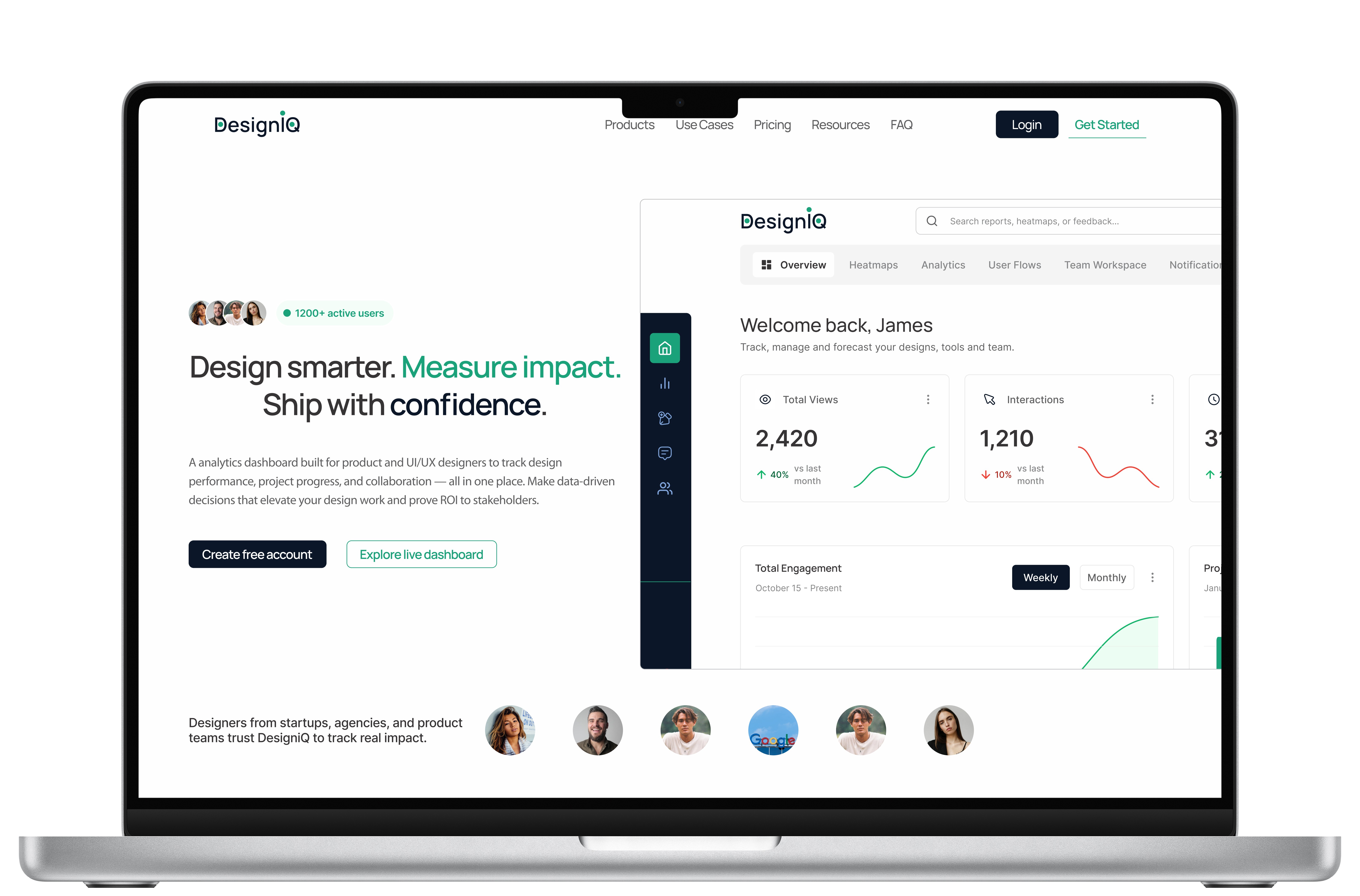
Over the past few days, I’ve been working on a landing page for DesigniQ—an analytics-first product built to help designers measure impact, not just ship screens.
While designing it, I made a conscious decision to focus less on aesthetics and more on clarity in decision-making. The goal wasn’t just to make something visually appealing, but to create a page that guides users, answers their questions, and helps them take action with confidence.
Here’s the thinking behind the layout:
1. The Hero Answers One Question
The hero section is designed to answer a single, critical question:
What problem does this solve, and why should I care?
No feature overload. No buzzwords. Just a clear value proposition paired with a direct call-to-action.
The idea is simple—if users don’t immediately understand the value, nothing else on the page matters.
2. Social Proof Comes Early (But Quietly)
Trust is essential, but it doesn’t always need to be loud.
Instead of heavy testimonials or disruptive sections, I introduced subtle trust signals early in the experience—user counts, avatars, and familiarity cues. These elements help reduce friction and build confidence without interrupting the flow of the page.
3. Restating Value Before Features
Before introducing features, the page takes a step back to reinforce why the product exists.
Measure design impact
Track progress
Make data-backed decisions
This reframing ensures users understand the intent behind the product before diving into how it works. Features are more meaningful when the purpose is already clear.
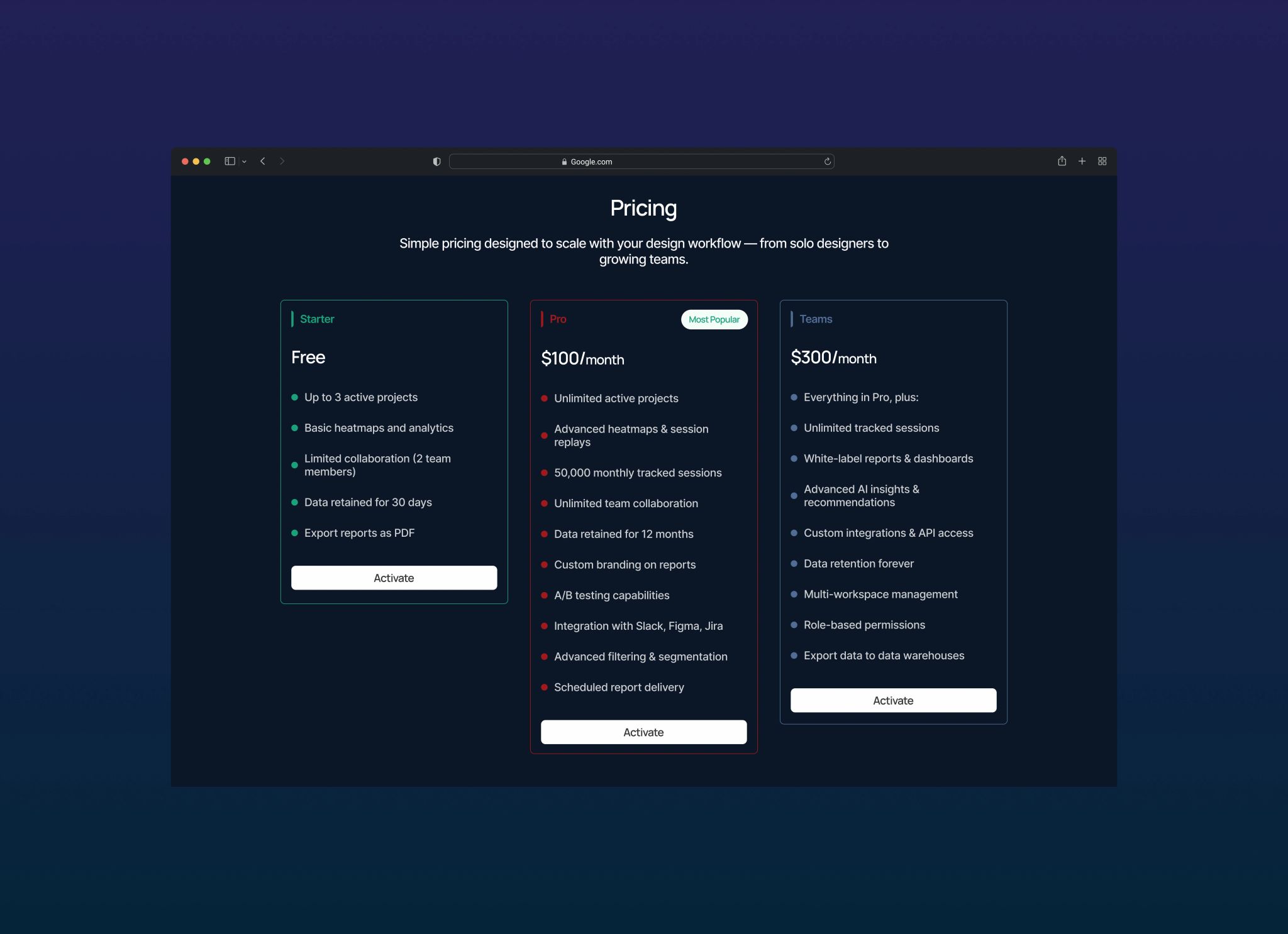
4. Pricing That’s Transparent, Not Clever
Pricing shouldn’t feel like a puzzle.
Each plan is structured to clearly answer three key questions:
Who is this for?
What do I get?
When should I upgrade?
No hidden logic. No confusing tiers. Just straightforward information that helps users make decisions quickly and confidently.
5. One Narrative, One Direction
Every section on the page serves a purpose.
There’s a single narrative flowing throughout—each part answering a question the user is already thinking. Nothing extra, nothing decorative for the sake of it.
This keeps the experience focused, intentional, and easy to follow.
Final Thoughts
This project was a reminder that good landing pages are not galleries—they’re conversations.
They guide users.
They reassure them.
They remove doubt.
Design isn’t about making things look impressive—it’s about making decisions easier.