If you’re designing in Figma without Auto Layout, you’re working harder than you need to.
At first, Auto Layout can feel frustrating. You apply it to a frame, and suddenly everything shifts—spacing changes, elements move, and it feels like you’ve lost control. It’s tempting to abandon it and go back to plain frames where everything stays exactly where you put it.
But that frustration is usually a sign of something deeper: a shift in how you think about design.
Once you understand Auto Layout, it doesn’t just improve your workflow—it completely changes it.
Consistency Without the Stress
One of the biggest challenges in UI design is maintaining consistent spacing and alignment. Without a system, you end up nudging elements by 1–2 pixels constantly, trying to “eyeball” perfection.
Auto Layout removes that guesswork.
It ensures your padding, spacing, and alignment stay uniform across your designs. Whether you're building buttons, cards, or entire sections, everything follows a consistent structure. This not only improves visual quality but also makes your components reusable and scalable.
Design Faster, Iterate Smarter
Design is rarely static. Text changes. Icons get added. Content grows.
Without Auto Layout, every small change creates a ripple effect—you have to manually adjust surrounding elements to keep things aligned.
With Auto Layout, the layout adapts automatically.
Change a label, and the container resizes. Add an icon, and spacing adjusts instantly. Instead of fixing layouts, you spend more time actually designing and solving problems.
Designing for Real-World Responsiveness
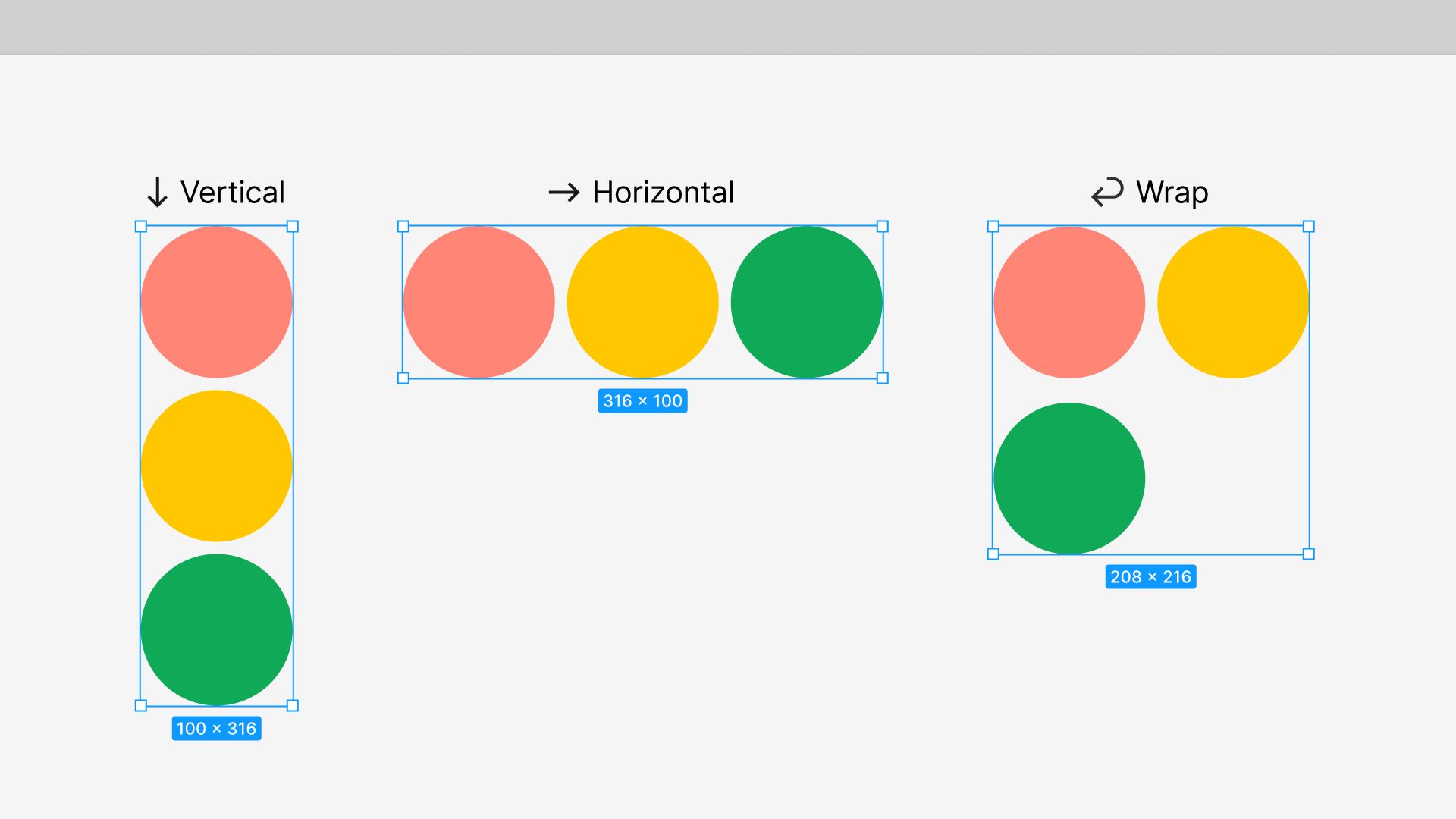
Auto Layout closely mirrors how layouts work in code—especially concepts like Flexbox.
That means you’re not just designing static screens; you’re designing systems that behave realistically across different screen sizes. It becomes much easier to think about responsiveness early, instead of treating it as an afterthought.
You design once, and your layout adapts.
It Builds Better Design Thinking
This is where Auto Layout becomes more than just a feature.
It forces you to think in systems:
How elements relate to each other
How spacing should be structured
How components should scale
You begin to design with intention instead of positioning things randomly. This mindset shift is what separates average designers from truly great ones.
A Practical Tip to Get Started
Don’t try to use Auto Layout everywhere immediately.
Start small.
Apply it to a simple button. Then try a card. Experiment with spacing, padding, and alignment. Get familiar with key properties like “Hug contents” and “Fill container.”
As your understanding grows, you’ll naturally start using it in more complex layouts.
Also, remember: not everything needs Auto Layout. Knowing when not to use it is just as important as knowing when to.
Final Thoughts
Auto Layout isn’t just a Figma feature—it’s a design habit.
It helps you create cleaner layouts, work faster, and build scalable systems. More importantly, it changes how you think about design structure and responsiveness.
Once it clicks, there’s no going back.