Starting the week with ₦100 Million in my foreign account…
…only problem is, I can’t seem to transfer it to my local bank.
(It’s all in my imagination — but really, what’s life without a little imagination? 😅)
Jokes aside, here’s something real.
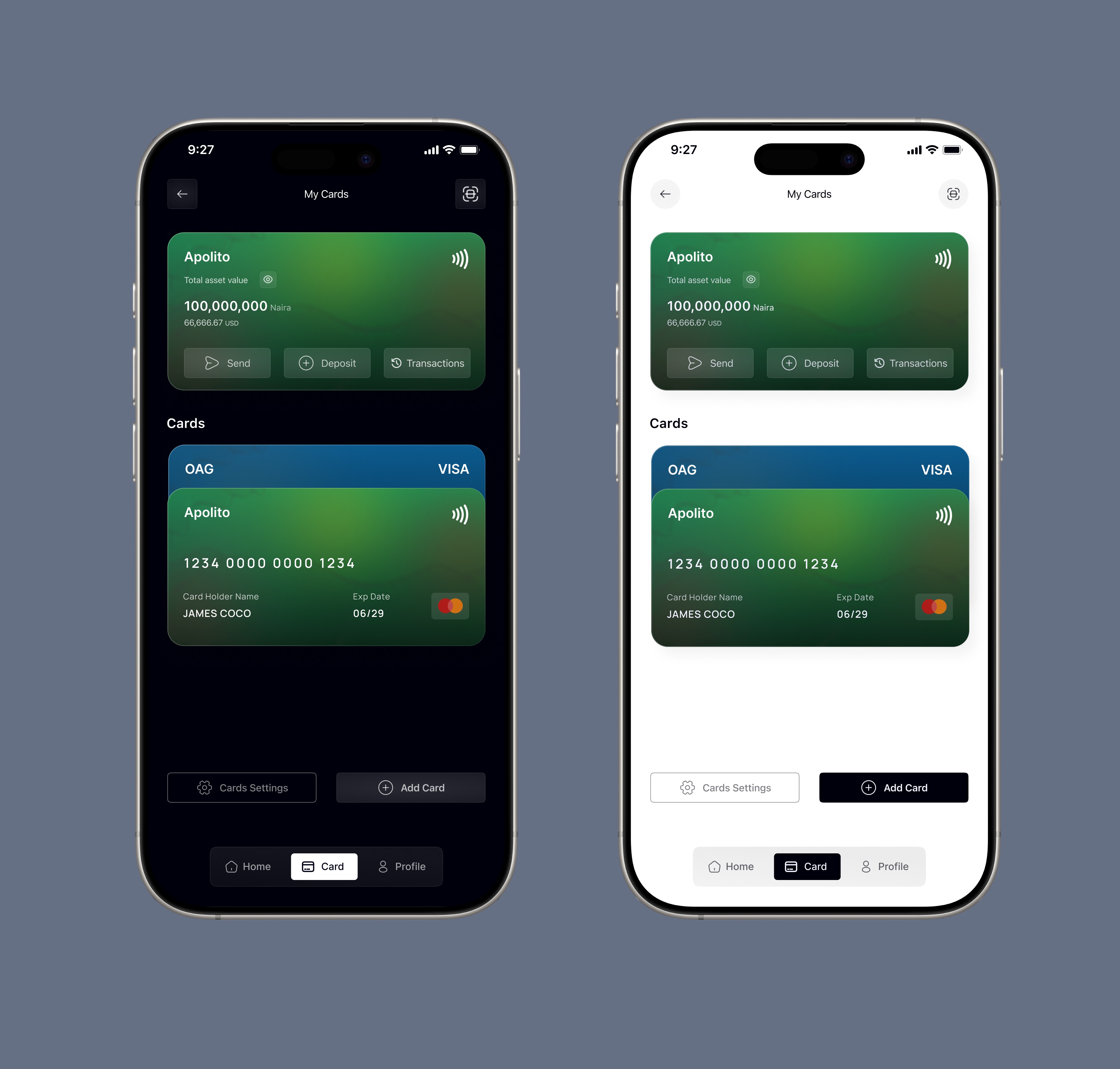
I recently explored a simple wallet app design. It’s been a while since I last worked on a mobile interface, so I approached this one with a clear intention: keep it minimal, but still expressive.
Instead of relying on vibrant colors, I focused on gray and white tones—pushing myself to understand how much balance, depth, and calmness they can bring into a layout.
Design Note
Grey, black, and white are the cheat codes of clean design.
They don’t scream for attention — they command it quietly.
Working with a neutral palette might seem limiting at first, but it actually sharpens your design thinking. Without color doing the heavy lifting, every other element has to work harder—and better.
Lessons from the Exploration
Contrast is Your Voice
The right shade of gray against white can communicate elegance far more effectively than loud, saturated colors. Subtle contrast, when done right, creates clarity and sophistication.
Hierarchy Matters More Than Ever
When you remove color as a primary differentiator, hierarchy becomes critical.
Light gray works well for secondary text, medium gray defines structure, and darker tones naturally draw attention to key elements. This creates a visual flow that feels intuitive and effortless.
Spacing Becomes the Real Color
In neutral interfaces, spacing does more than just organize—it defines the experience. Margins, padding, and whitespace become the elements that create rhythm, breathing room, and focus. Combined with subtle shadows, they add depth without overwhelming the user.
Consistency is What Makes It Beautiful
Neutral palettes only shine when applied intentionally. Inconsistent use of gray tones can quickly make a design feel messy or unbalanced. But when done right, the result is clean, cohesive, and quietly powerful.
Back to Simplicity
There’s no deep backstory behind this one.
Just me getting back into the flow of mobile design—stripping things down, focusing on the essentials, and rediscovering the joy of creating simple, thoughtful interfaces.
Sometimes, the best designs aren’t the loudest ones. They’re the ones that feel effortless.