Ever wondered why pricing pages often make or break conversions?
Recently, I had a deep conversation with AI exploring this exact topic—and it aligned closely with what I’ve experienced firsthand while designing pricing sections across e-commerce, SaaS, and service platforms.
Over time, I’ve realized that pricing design isn’t just about layout or aesthetics. It’s about psychology—how users perceive value, make decisions, and respond to subtle cues.
Here are some of the most impactful principles I’ve seen in action:
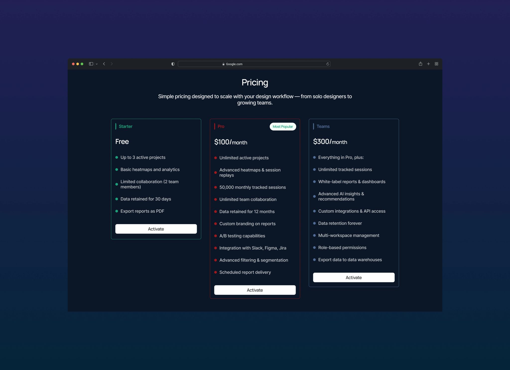
1. Why the Middle Option is Always “Most Popular”
It’s not necessarily because it is the most popular—it’s because of anchoring.
When I introduced a “Most Popular” badge to the mid-tier plan in one project, conversions to that tier increased by 47%.
Users naturally avoid extremes. The cheapest option feels limiting, the most expensive feels risky—so the middle becomes the “safe” choice. Add a social signal, and it reinforces that decision even more.
2. Why Prices End in 9 or 7 (Not 0)
₦9,999 feels significantly cheaper than ₦10,000—even though the difference is just ₦1.
In one test, ₦4,999 outperformed ₦5,000 with a 23% higher click-through rate.
This happens because people process numbers from left to right. The first digit creates the strongest impression, so “4” feels cheaper than “5” before the brain fully registers the full amount.
3. Why “Save 30%” Works Better Than “Was ₦10,000, Now ₦7,000”
For lower-priced items, percentages tend to feel more impactful than raw numbers.
But for high-ticket pricing, the opposite is true—showing actual savings (like “₦500,000 off”) creates stronger perceived value.
The takeaway here is simple: context matters. The way you frame savings should match the scale of the price.
4. Why Monthly Pricing is Shown First
Even when annual plans offer better value, monthly pricing is usually the first thing users see.
Why? Lower entry cost means less friction.
For example, displaying “₦999/month” prominently, followed by “₦9,990/year (save 17%)” led to more users starting with the product. Interestingly, a significant portion later upgraded to annual plans after experiencing the value.
The strategy is simple—reduce the barrier to entry, then optimize for long-term conversion.
5. Why “Free Trial” Beats “Free Plan”
Words matter more than we think.
“Free Plan” suggests no commitment.
“Free Trial” suggests a beginning—with an expectation of upgrade.
In one case, switching to “14-Day Free Trial” increased paid conversions by 28%.
The difference is subtle, but powerful. Language shapes behavior.
6. Why Enterprise Pricing is Hidden Behind “Contact Us”
Enterprise pricing is rarely straightforward.
Displaying a high price upfront can discourage smaller customers who might otherwise convert on lower tiers. By using “Contact Us,” you create a sense of exclusivity while allowing flexibility in pricing discussions.
It filters the audience without creating unnecessary friction.
7. Why Feature Comparison Tables Often Fail
At one point, I designed a pricing table with over 25 features.
It looked comprehensive—but conversions dropped.
After simplifying it to just 5 core features per tier, conversions doubled.
Too many options overwhelm users. Instead of helping them decide, it creates hesitation. The key is to highlight what truly matters and remove everything else.
Final Thoughts
The biggest lesson?
Pricing design isn’t about making things look good—it’s about making decisions easier.
It’s about understanding how users think, reducing friction, and guiding them toward the option that feels right.
Small details—like a badge, a word, or even a number format—can significantly impact conversion rates.
And often, those small changes are the difference between a user hesitating… and a user converting.